7 Font Crimes That Make Designers Physically Uncomfortable
Comic Sans on a resume. Papyrus on a restaurant menu. Here's why certain font choices cause actual pain and what to use instead.
Typography is one of those things most people never think about. But designers? Designers see bad fonts the way musicians hear off-key singing. It physically hurts.
Here are seven font crimes happening right now, probably within a 5-mile radius of you.
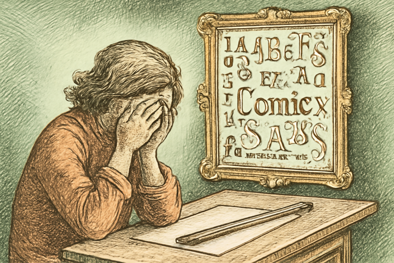
Crime 1: Comic Sans on Professional Documents
Comic Sans was designed for comic book speech bubbles in a children’s program. It was never meant to appear on your tax documents, your resume, or (this actually happened) a hospital’s cancer diagnosis letter.
Use it for: birthday party invitations for 7-year-olds. That’s the complete list.
Crime 2: Papyrus on Restaurant Menus
If your Thai restaurant uses Papyrus, your pad thai better transcend reality. This font screams “I spent 30 seconds choosing this in Microsoft Word.” James Cameron used it for Avatar’s subtitles and the internet has never forgiven him.
Crime 3: Using 6+ Fonts on One Page
Every font you add is a voice in the conversation. One or two voices? A pleasant chat. Six voices? A food court argument. Stick to two fonts max: one for headings, one for body text. Use the typography pairing tool to find combos that actually work.
Crime 4: Tiny Text on Mobile
If someone needs to pinch-zoom to read your website on their phone, you’ve failed. Body text should be at least 16px. Use a font size scale generator to build a harmonious type scale that’s readable on every screen.
Crime 5: White Text on Light Background
This isn’t a font choice, it’s a disappearing act. If your text-to-background contrast ratio is below 4.5:1, people literally cannot read it. Check your combos with a color contrast checker.
Crime 6: All Caps Everything
USING ALL CAPS FOR BODY TEXT MAKES EVERYTHING FEEL LIKE YOUR DAD IS TEXTING YOU ABOUT THE THERMOSTAT. It’s also harder to read because we recognize words partly by their shape, and all-caps removes the ascenders and descenders that help.
All caps for a short heading? Fine. All caps for three paragraphs? War crime.
Crime 7: Decorative Fonts for Body Text
That beautiful script font looks amazing as a logo. It becomes unreadable torture after two sentences. Script and decorative fonts are spices, not the main course. Use them for headlines or accents, never for paragraphs.
How to Choose Fonts That Don’t Hurt People
- Preview before committing. Use a font preview tool to see how fonts look with your actual content.
- Pair strategically. Contrast serif headings with sans-serif body text (or vice versa). The typography pairing tool shows you proven combinations.
- Test readability. If your grandma can’t read it on her phone, pick a different font.
- When in doubt, go boring. Inter, System UI, Georgia, Helvetica. Nobody ever got fired for choosing a readable font.
The best typography is invisible. You don’t notice it, you just read. That’s the goal.